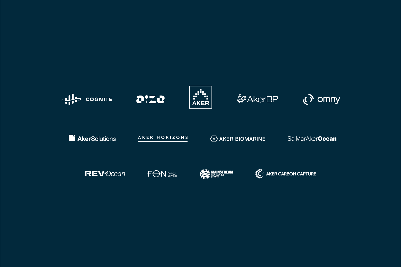
Aker family – cobranding
The Aker group consist of several companies. Often we experience the need to brand events or initiatives with two or more logos.
Colours
The cobranding is based on the Aker ASA brand principles; dark blue, grey and beige.
Font
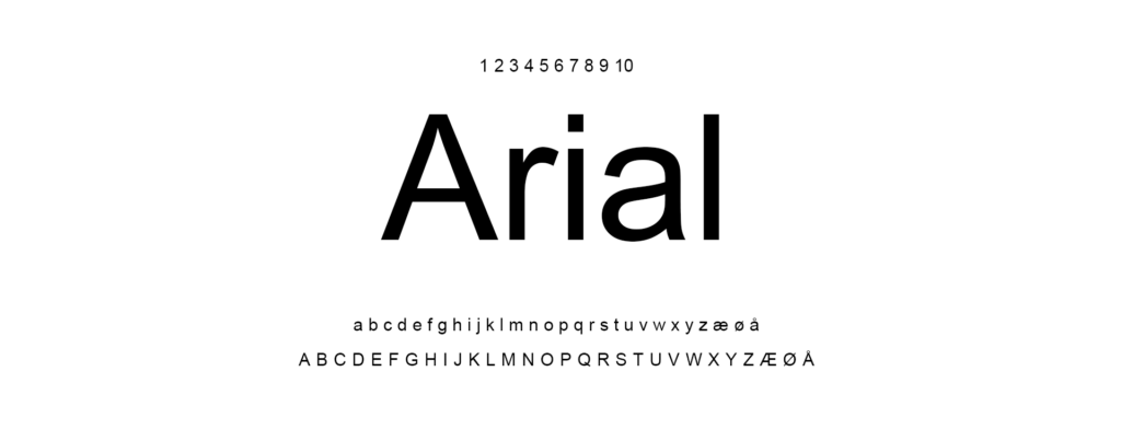
Arial shall be used on banners, roll-ups and other common materials.
Logofiles





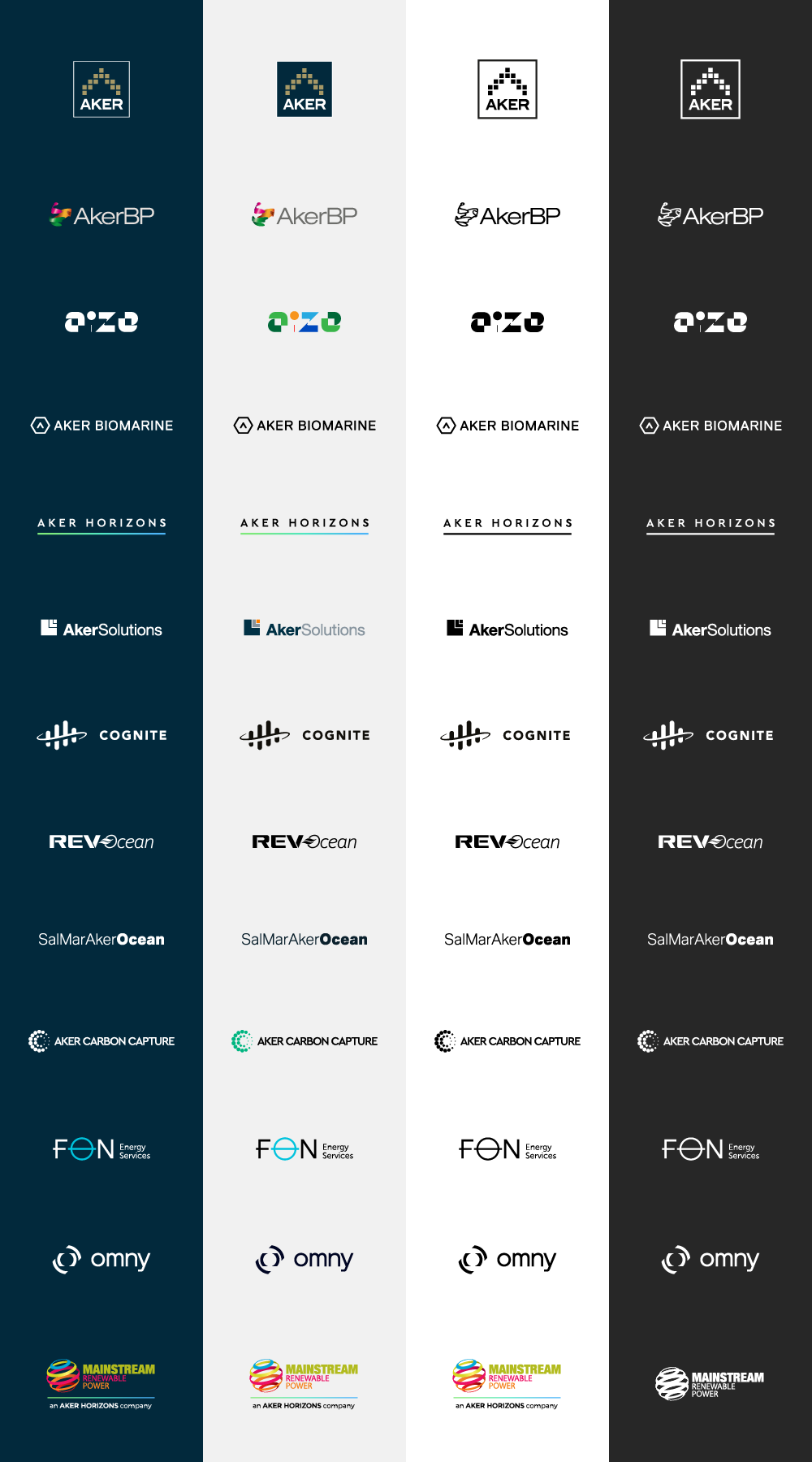
Please note that the logos come in full colour and as mono / one colour.
It is not permitted to manually use black & white filter on coloured logos.
The correct mono version shall be used.
Cobranding
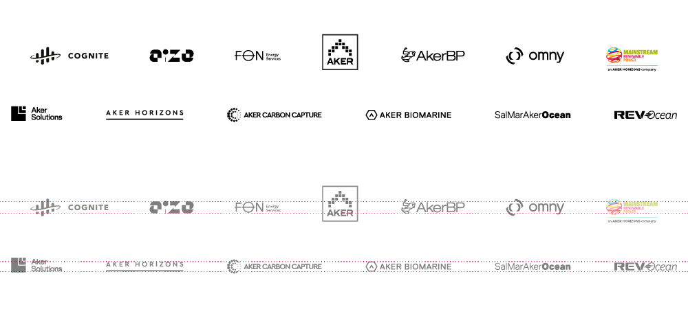
When using the logos together, the logos must be equally weighted and placed in line, and with equal spacing. The goal is to present them together in a tidy, clean manner.
It is recommended to use monochromatic logos. Color logos must only be used if there is a requirement (or if there’s no monochromatic logo available).
Logos must be placed equally after the name stroke, but some logos will require adjustment below/above the baseline.
Clear space
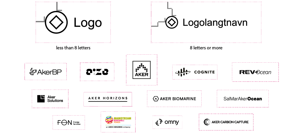
Logos need air around it, which must be free of other elements. Text or graphic elements must not be placed within this area. This space is often called clear space or white space.
Use the largest letter in you chosen logo as a starting point, and use its size as the distance around the logo on all four sides. On logos with less than 8 letters, one letter-distance on each side will suffice. However, on logos with 8 letters or more, you’ll need 2x the letter-distance to achieve enough space.
Below is a visualization of the required clear space for all Aker logos.
Minimum recommended sizes
The logo has defined minimum sizes to ensure good readability.
The dimensions refer to the width of the logo. Note that there are different measurements for horizontal and vertical layouts.

Templates
Please find a selection of co-branding templates below. All of these can be adjusted to specific events.
